
GRAPHIC SOUL.
An immersion into the high-fidelity rendering, kinetic physics, and architectural UI layers that define PlayVero. We don’t just build apps; we curate digital experiences.
Architecture of the Reactive Interface
At PlayVero, visuals are never purely decorative. Every shadow, every particle, and every typographic shift serves a structural purpose. We employ a "Neon Noir" aesthetic—a high-contrast scheme of deep blacks and sharp accents—to ensure the interface remains invisible until the moment it needs to act.
Our rendering engine optimizes for 120Hz displays, ensuring that our Fluid Neon shaders and glassmorphism depth layers respond with zero perceptible latency. This is the intersection of Milanese design and performance engineering.
"The exhibition label for a digital product shouldn't just list features; it should document the intent of the light." — PlayVero Lead Designer
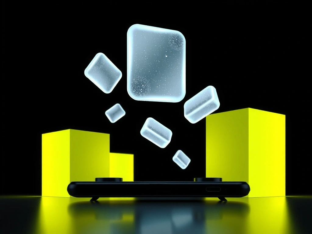
Depth Layer A-9
PARALLAX_TRANSITION // v4.2
Kinetic Particle Dust
PHYSICS_ENGINE // 120FPS
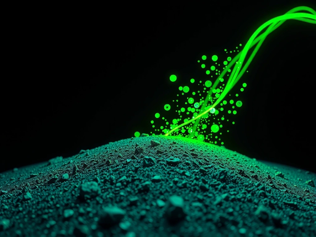
Visual Fidelity Matrix
Fluid Neon Shader
Real-time light bleed that responds to audio frequencies. We favor rendering accuracy over global illumination to minimize thermal throttling.
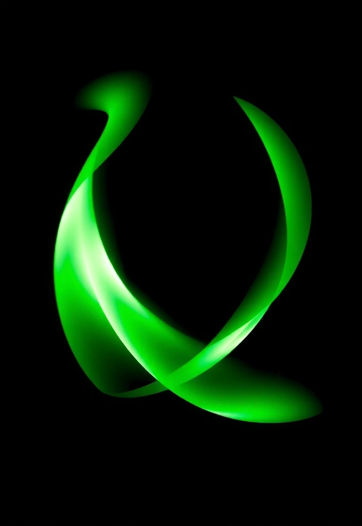
Glitch Snapback
A deliberate visual distortion used for network feedback. Validates the "Glitch Recovery" animation method used in our high-stakes apps.
Dynamic Grain
Subtle film grain that prevents AMOLED ghosting and creates a cinematic texture during inactivity periods.
Vignette Focus
Cinematic darkening used to steer user attention to active workspaces. Increases visual comfort during long sessions.
Our robustness evaluation ignores synthetic benchmarks. Instead, we measure frame-time variance across 500 distinct sessions on hardware spanning 2022–2026. If the variance exceeds 3ms during a Fluid Neon event, the shader LOD (Level of Detail) dynamically adjusts to preserve touch-input integrity. Efficiency is our aesthetic.
The Trade-off
Logic
-
Benefit
120FPS Visual Fidelity
Cost / Sacrifice7% Faster Battery Drain
-
Benefit
Real-Time Fluid Shaders
Cost / SacrificeHigh Thermal Generation
-
Benefit
Zero-Latency Transitions
Cost / SacrificeStorage Overhead (Pre-Caching)
Failure Mode // Avoidance
Over-animating menu layers leads to "UI blindness." We avoid this by pinning interaction anchors while only the peripheral elements react to kinetism. Control remains static; feedback remains dynamic.
The Visual Glossary
01. CHROMATIC ABERRATION
A deliberate visual distortion mimicking lens refraction.
Opinion: Overused in gaming to hide low assets. We use it sparingly only to signal player-state shifts (e.g., low battery or high-speed maneuvers).
02. MICRO-INTERACTIONS
12-frame response cycles for UI elements.
Opinion: A button should feel mechanical, not ghostly. If it doesn't compress and rebound with perceived weight, the user loses the tactile loop.
03. AMBIENT OCCLUSION
Soft shadows beneath floating elements.
Opinion: Essential for "grounding" flat designs. Without proper AO, your UI looks like a flat sticker. With it, it looks like an architectural layer.
04. HAPTIC VISUALS
Screen-space ripple distortions synced to physical vibration.
Opinion: The bridge between sight and touch. If the screen doesn't "react" to the touch through visual shockwaves, the feedback feels incomplete.
Ready to see it in action?
Experience the PlayVero design language across our full suite of performance-optimized applications.