Est. 2021 // Roma, Italia
Can gaming interface
be high art?
PlayVero rejects the "template culture" of modern app stores. We build digital artifacts where animation curves are as deliberate as a painter’s stroke.
Born from the pursuit of tactile truth.
PlayVero was founded in Rome by a collective of Triple-A veterans who grew weary of the sanitized, generic interfaces dominating the mobile landscape. Our name—derived from "Play" and "Vero" (Truth)—is our promise to move away from skin-deep design.
"Most gaming apps feel like clones. They lack weight, momentum, and the satisfying 'click' of a premium physical object. We set out to fix the tactile void."

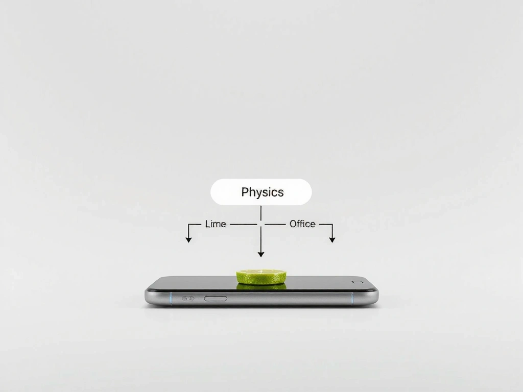
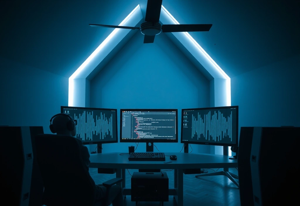
Our designers debate the exact millisecond of haptic response. We treat pixel motion as physical engineering, ensuring every interaction carries weighted momentum.
Our Architectural
Decision Matrix
Functional Brutalism
Every element must justify its existence. If it doesn't aid the player's intuition, it is noise. We prioritize legibility over decoration.
Momentum UI
Interfaces shouldn't just "appear." They should slide, bounce, and react to your input with a consistent weight that mimics real physical objects.
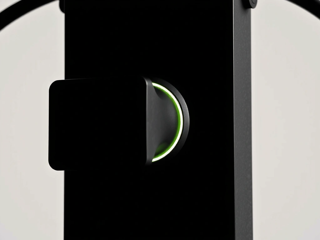
Hard Contrast
We use stark whites and absolute blacks to create a gallery-like focus on content, punctuated by lime highlights that guide action.
We don’t believe in "one size fits all." Every project at PlayVero starts with a blank canvas. We intentionally reject the Bootstrap/Material design aesthetics in favor of a unique visual signature for every partner.
"Our goal is Zero-Friction. We want the interface to disappear so completely that the player forgets they are holding a device. It should feel like a direct link to the game world."
Engineering Trade-offs
We prioritize frame rate stability over complex shaders. 120FPS on a simple UI beats 30FPS on a bloated one every single time.
Layered glass effects add visual luxury but increase battery drain. Our mitigation is "Smart-Culling" based on device temperature.
Custom components have a steeper learning curve. We mitigate this through obsessive consistency across the entire app ecosystem.
Our hard-contrast dark mode is visually stunning but requires high-contrast lime highlights to meet WCAG standards for readability.
Join the Gallery.
Ready to evolve your application’s visual language? We are selectively accepting new collaborations for the Winter 2026 cycle.
Optimized for iOS 15.0+ and Android 11+. Full support for 120Hz ProMotion displays.
Privacy-first data policy. No third-party ad SDKs. Audited security architecture.
Via Roma 45, 00184 Roma, Italy
Mon-Fri: 9:00-18:00 CET